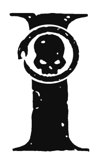
I hadn't intended to post this today, but decided that I might as well anyway. Some time ago I created a
graphic for the Officio Medicae to go with the new 40k medical fluff I was working on, but later realised I needed a simpler variant that was clear and distinct even at low resoultions (and also to be turned into transfers for objective items and vehicles... watch this space).
So I had a tinker around and came up with these variants, the first
is a simplification of the previous logo using existing 40k design
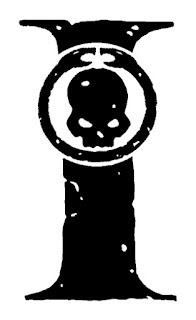
elements, whereas the latter two were an attempt to utilise the standard
design for various Imperial organisations and offices ("I with
Circle").
Thoughts and feedback would be much appreciated!
Symbols below...
 |
| Version 1 |
 |
| Version 2 (Our Rob or Ross*) |
 |
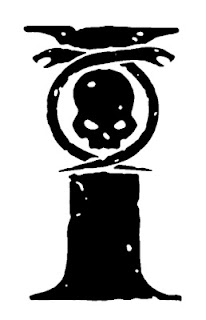
| Version 2.5 (The Torc) |
 |
| Version 2.5b - based on Buffer's comments, a bit different, but may lose clarity when shrunk down |
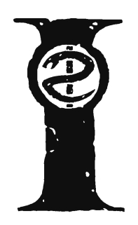 |
| Version 3 (I, Asclepius) |
*Obligatory
Red Dwarf reference...


Nice. Chimera ambulances.... Now, how many would I need for a Field Ambulance detachment ? Flufftsatically, they'd have the single HB turret, rather than the ML and possibly increased headroom (like the Samaritan) and no cargo served las guns. And definitely a tent or two, like Col Corbane's.
ReplyDeleteI love the first, quite like the second and I'm not particularly sold on the third. I think the second would look better if it had heads meeting at the top of the circle like on the original art, rather than eating its tail, but its just an opinion. I love the idea of chimera ambulances! Or dedicated casevac valkaries?
ReplyDeleteThanks very much, wanted to do some sort of Chimera variant for ages, after seeing Col. Corbane's Field Ambulance it's just made me want to do them all the more - pretty much something along the lines of a Samaritan would be the idea Zzzzzz. Myself and Col. Scipio may be working on a joint project/diorama, so watch this space.... Liking the sound of some sort of Air-evac / MERT there Buffer, may have to give that a try too in the long term,
ReplyDeleteI didn't do a double headed variant initially as I thought it would be a little two crowded, especially when shrunk down to the smallest size, but have knocked together a quick mock up of the concept too :) it's now above as 2.5 (I thought it looked a bit like a Celtic torc)
Now personally I really like that, is it possible to have crossed tails at the bottom?
ReplyDeleteHmmm, you've given me an idea for a "cunning plan"
DeleteI like version 1 the best, looks very cool!
ReplyDeleteThanks very much Ray. Definitely using that one, just wanted an alternate that fits the Imperium "brand guidelines" more closely too :P
ReplyDeleteThey're very cool.
ReplyDeleteV1 is my personal fav. I think it could look good on any IG vehicle.
V2 reminds me of the World Snake from Norse Mythology "Jörmungandr."
V2.5 again reminds me of some old Mytology. Something about a Snake/serpent god who could see into both the future and the past. I heard it from the show "Stargate" so I could be quoting fiction.
V3 Simply invoces the idea of money. f you've seen the MV for "Land of Confusion" by Disturbed, or "Do the Evolution" by Pearl Jam (I thinks its in that second one IIRC)
Not sure which RD ref you're talking about. *derp face*
Yeah 1 is definitely my fave too and it was always going to be used, just as its the simplification of my earlier version. V2 was based on ouroboros, the eternal snake of world mythology (which is on the box Lister is found in under the pool table on series 7 - the chaps that found it thought it said Our Rob or Ross for the baby's name. To be fair it's series 7, I absolutely forgive anyone for not getting that reference).
DeleteThe first one really says "Medicae" to me. The intertwined snake emblem of the caduceus is key. Don't get me wrong though, I like the other emblems as well - I totally dig that you've embraced the "I" motif for the various Adepta!
ReplyDeleteThe second one makes me think of an inquisitorial branch dedicated to stamping out followers of Tzeentch (the Oroborous being one of the KSons many symbols). The third one similarly makes me think of an inquisitorial branch dedicated to rooting out genestealer cults for some reason. Of course, that presupposes the three side bars that are usually found on the Inquisitorial =I= in addition to the current look.
Not sure entirely what to think of the fourth one. Ordo Accountimantus? "We know from whence the Throne Gelt flows!"
I'm looking forward to seeing what you do with the Chimera variant idea - sounds really cool!
Thanks very much, the first one was a definite already as it's just the plain form of my earlier caduceus/asclepius - for the reasons you say. The others were experiments to try and keep with the Adepta "I" motif as you say, but I really don't think they're clear - I definitely think that one looks like a Genestealer / Tzeentch-based )or opposing) organisation too :/
DeleteLmao, I think Ordo Accountimantus needs to be offical now. Ironically it's the single snake that's medical and the twin snakes of the caduceus that are supposed to be the symbol of commerce, but my version just looks a dollar sign :/ Although I have been trying to emphasise the idea that the Imperium only heals its troops when it's quicker and easier than recruiting and training a replacement... so maybe a dollar sign is apt
2.5b gets my vote after 1.
ReplyDeleteAll are nicely done though.
Thanks very much Dai
DeleteI hate them all! But I especially like 3. I wish the Palladians had some more medical care in their fluff, just so I can make an ambulance with that plastered all over it. Also looking at this it's easy to forget the enormous skill that goes into making these (my ham-fisted computer skills mean that I have to ask Headologist to make these sorts of things up for me, and have done for the past 10 years, so I have to keep him buttered up). But seriously, very nice work.
ReplyDeleteVery kind of you, well not the hate part ;) I think 3 is my favourite cos it's the most obvious, but I may redo it to look less like a mirrored dollar sign
DeleteHeadologist can I be awkward and ask you to create one with the crossed tails at the bottom (like 2.5b) but heads meeting at the top (like 2.5)? That feels like it would look really cool. My favourite is still 1, but if you want to include the I, personally I think that would look good. Have you thought about creating one where the snakes criss cross down the middle like in 1, but over the top of the I? Or would that distort the overall effect too much?
ReplyDeleteI would love that but as the idea was for simpler, small clear designs that would really distort it and wouldn't fit in with the general "I" logos already existing :/
DeleteSaying that, I'll have a go at one where the heads face inwards, but probably won't meet - this one is already taller and I wanted to try and stick to the standard size and spacing. Did consider doing the image over the I but as none of the others do that I wanted to stick with the theme (the most radical is the Arbites one which has the scales extending from the circle).
DeleteI love all of these. When I get around to making a figure of the Medicae I will definitely be using symbol 1 on the breast of his scrub jacket.
ReplyDeleteThanks Chris, really looking forward to seeing him and the rest of the Necromunda stuff
DeleteI’m not that much of a internet reader to be honest but your blogs really nice, keep it up! I’ll go ahead and bookmark your site to come back in the future. Many thanks|
ReplyDeleteFeel free to surf to my page - 대구오피
(jk)